Posts

Blog #17

Image
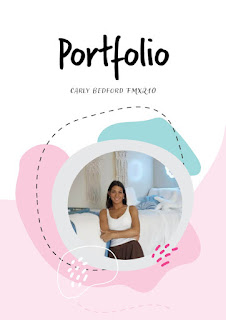
After finishing all my porjects I created a portfolio in InDesign using a template to organize. I added my files from illustrator, photshop nad InDesign along with artist statements that I've wrote. Using the template with honestly fun, because I got to insert my work and words in each page and it hleped me organize it and make it look cohesive. While creating this portfolio I was able to look back on all teh work that I've done this emester and how much my ability to create art has enhanced. I enjoyed this class very mucha nd each project helped em learn something new. I tired to keep the portfolio neat y using three main fonts and about 6 different colors. It came out exactly like what I was picturing in my head.

Blog #16

Image
       To create my business cards I started with the sketches above to get an idea. After brainstorming I used inDesign to create three different cards based on my three color versions of my logo. The color inspiration was based of of each logo and I used different placements for the logo in each card. The more I got comfortable using InDesign, the more I was able to create a more customized card. I used effects, the pen tool, and different fonts to make each card unique and clear.     

Blog #15

Image
  I created a post card from New York City because I am from New York and the city is one of my favorite places to go. I used indesign to create the city landscape background and then added a second page to be the back of the card. I used nacy blue text throughout the card becasue it matched teh image of the city and I felt that the font matched as well. In teh top right corner is my logo that I previously created and I think it completes the postcard well.

Blog #14

Image
  This tutroial taught me a short cut that if you hold space and left click the canvas can be moved around which can be handy if I need to focus on just one side of a project. It also explained the master page, and showed how if there is something on the master page it will show up in that spot on all other pages. I liked how it demonstrated easy controls that I will often use like clciking alt. and dragging to copy an item. One of the mos useful tips I learned from this video is that I can click an iamge from my files and drag it into a box on Indesign and it will insert normally. Previewing the canvas by clicking W allows me to see my work without any guidlines which will help create anything in general and see the previewed finished product. This tutorial focused more on differnt techniques of placing text and images together on different or the same layers. He described transparecy and blending which gave me inspiration for projects that I will do. He was very clear and explain...

Blog #13

Image
  I created a frame by frame animation using adobe photoshop. I started with the idea in my head from a popular Nintendo video game I used to play when I was younger. I then found the images mabove to create a stroy that I could bring to life in photshop. I placed the background first and masked out ach of the other aspects so they stood alone with no background. I created a new layer for each frame and than used the frame by fream animation button to make it able to play. The moon animation included my tag brush and foloowing it are my credits.     I wanted to make something that was fun and told a short story. I found it most difficult to smooth out the movement of the alien but I enjoyed piecing each part together and seeing it come to life from just stock images. This was one of my favorite projects to create, although the hardest, because the result was super rewarding.

Blog #12

Image
  Here I chose a scene from my favorite sitcom, Friends, to put myself into. I replaced Rachel Greene in her robe with a picture of me in mine. I first found the clip of Monica and Rachel and then embedded the photo of myself over it. After, I used teh quick selction tool to mask out my body only. I made multiple adjustment layers of myself to change the lighting and tones of my image. I used a hue and stauration layer and a curves layer. I then used the clone stamp to fix any imperfections and the seemlessly combine the two images. This project was definitley a challenge, but I enjoyed bring it to life and seeing it look more realistic as I worked on it.

Blog #11

Image
  I think this photo would be hard to photshop myself into beuase a third person would be awkard on either side and the lighting is so bright it woul dbe hard to duplicate it for the photoshop to look realistic. I like how this picture is funny but also serious. It gave me an idea to do a movie scene with men in suits or something around that area. I also am inspired to do a pcicture of my7slef with other people, not just me in the image. This was funny, I like how I would expect the kid to enlogated but the dad was shrunk instead. This is definitely my favorite illusion, I find it very interesting that I can't tell in the first picture that the objects are actually mini. I think recreating this type ofillusion could be really cool and fun to incorporate myself into it.