Posts

Showing posts from October, 2023

Blog #10

Image
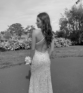
  I created three different versions of my orignal picture using collor palletes from adobe colorwheel as well as photoshop. To start the process, I took my original image and converted it to a black and white image. I then went to adobe color wheel and started with a base color. After choosing my base color, I selected different combinations such as Triad, Split Complementary, and Double Split Complementary. For each image I colored the dress, corsage, and flowers. For two of the images I colored the hair but for the third I decided to leave out this detail and instead colored the grass two different version of one color. Althought not realistic colors, I tried to strategically pick which colors would go where so the iamge had some grasp to it.      I enjoyed the process and after doing it three times have learned how to create a layer with a mask and what the purpose it. It became very helpful to fix the imperfections I made while selecting each shape and I also en...

Blog #7

Image
       This photogrpah from "The People's Portfolio" stuck out to me the most because it made me feel happy and proud. Although subtle, Harry Belafonte's smile gives the image hope and makes the audience feel welcomed. His background infromation concluded that he is a social activist and supported the civil rights act early on. This brought me close to my emotions because he looks as if he is a peace or has accomplished something, which he has. He has made a difference to the country and the rights of people who are deserving. The next photograph also stuck out to me because the mother has so much emotion running through her while the baby represents innocence and the lack of negative knowledge. The woman in this photo creates emotions that I felt for her and for her struggles as her partner was not able to see his baby grow becuase of immigration detention.     My photos above tell a little bit about who I am although they don't include much story when jus...

Blog #8

Image
       To create this image, I learned a new skill which was creating my own brush in photoshop. I used the free transform tool to keep my logo visibal while adding the spray and grittiness to it simultaneously. After creating the brush with other embeddded aspects, I used it to create the colorful image above. My inspiration was something fun and light so I used bright colors and scattered them randomly. For some of the parts I used a smaller brush to contrast the large imprints I made at first. Dragging the brush gave a spray paint effect so I chose to do this is blank areas to add depth. I really enhoyed the freedom of this image and found it interesting to look at.     

Blog #9

Image
  This tutorial explained the layot of photosho, explaining the basics of what is on the left, right and to of the screen. He explained the history tab which I see myself using in class becasue it allows me to go foward and backward in my work. The move tool is helpful to move pieces around as well as the selection tool I will use often to control what I am doing. The eyedropper tool is also one of my favorites because its easy to color match two items. The spot healing tool is something I didn't know about and can be used to fix imperfections quickly and easily. This and the brush tool I think we be used often. Mostyl the layout of  photoshop is similar to adobe illustrator but the tools are different and I'm excited to learn how to apply them. This video explained how illustrator uses pixels, which are small boxes with their own individual colors. He explained how the options bar relates differently to each tool that is selected. The layers section is also very important bec...

Blog #6

Image
I created this propoganda poster with recycling as an inspirartion because its always been something I am passionate about. I have grown up recycle and continue to do it on my own becasue the earth does not deserve our waste. I used repetion as a tatic to portray the message to recycle. I also used blues and greens which I think best represented recycling as well as the earth. The background color is a gradient as well as the color inside the sign, I did this purposely so the text and my self potrait stand out, while the recycling signs are still a main focus. My message displays ergency as mother nature "needs" more people to recycle and save our planet.  

Blog #5

Image
     My final work is a combination of logos that represent my initials. The ocean wave represents the sea which stands for my inital "C". Likewise, the bee represents my lastname initial "B". These letters will alwasy be a apart of me, hense teh reason tehy are perfect for my personal logo. My inital sketch was based of something simple, like other logos, I didnt want mine to be too confusing or too busy, instead I made it easy on the eye and something that people can pick apart simply. My favorite aspect of the piece is the heart that is made by the bee's two wings, because a huge part of me and something I am always grateful for is love.      To create my sketch on adobe illustrator, I started with the body and used to ellipse tool to create an even oval. I then used the pen tool for the simple lines and the white selection tool in order to get the wave to have the right curve. When choosing the color palletes I researched what colors went well together ...